1、首先我们需要先新建一个WebApp项目,目录结构为:
index.html 项目首页html入口文件
--html 项目文件夹
--html/css 用于存放用到的css文件
--html/js 用于存放用到的js文件
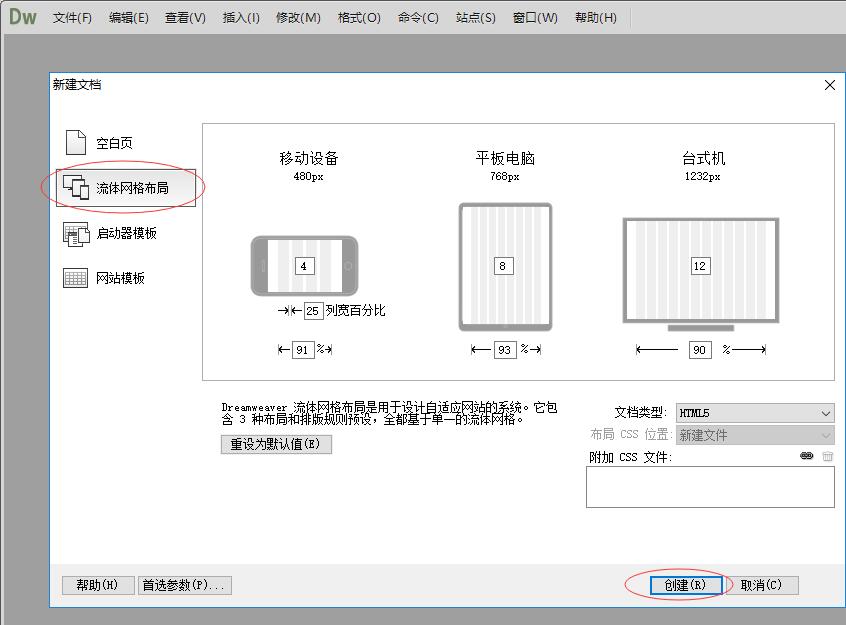
2、index.html我们可以用Dreamweaver CC来新建,操作如下:点击文件菜单,再点新建,在弹出的窗口中点流体网格布局,再点创建。
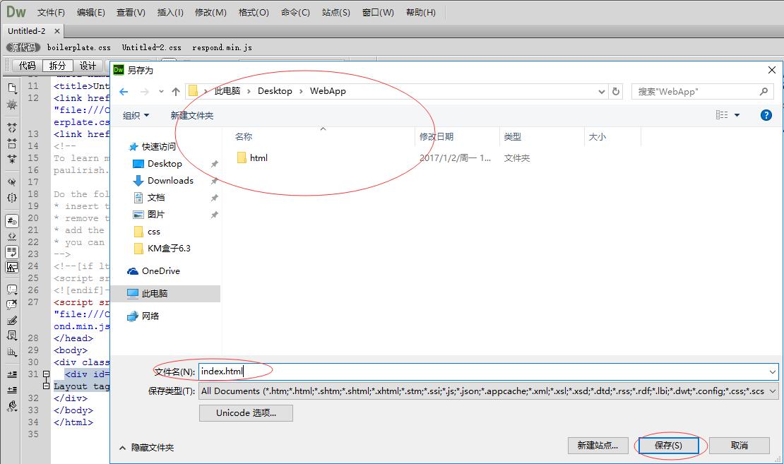
3、创建好html文件后,点击文件-另存为,将文件名改为:index.html,保存到我们新建的WebApp项目根目录下。如下图:
4、这时会弹出一个对话框,提示内容如下:
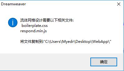
这时,我们将用到的boilerplate.css文件和Untitled-2.css文件,复制到WebApp项目html/css目录下,将用到的respond.min.js文件复制到WebApp项目html/js目录下。
这里解释下,boilerplate.css是定义跨浏览器兼容性的样式文件,Untitled-2.css是定义自适应媒体查询的样式文件,respond.min.js扩展IE8以下浏览器支持css3的文件,如果不需要考虑支持IE8以下浏览器,可以删除掉。
这里由于我们是打包生成手机端的APP,不需要用到respond.min.js,我们把它删除掉,然后再修改下CSS的引用路径,如下:
<link href="html/css/boilerplate.css" rel="stylesheet" type="text/css">
<link href="html/css/Untitled-1.css" rel="stylesheet" type="text/css">
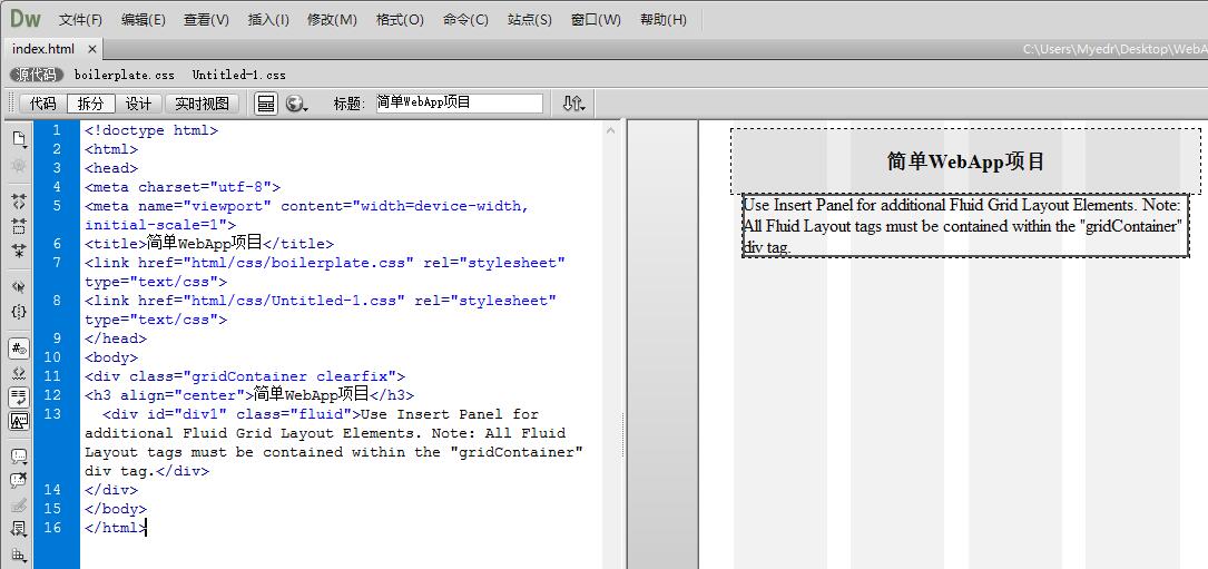
5、这样一个简单的WebApp项目就新建好了,优化下html代码,如下图:
6、接着我们来使用KM盒子将这个WebApp项目打包生成手机APP应用。
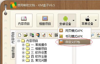
打开KM盒子软件,点击安卓设备按钮,在弹出的菜单中选择 自定义打包。
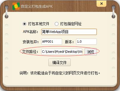
接着,在弹出的对话框,设置 APK名称,安装包ID,文件路径选择我们刚才的WeApp文件夹目录,然后点击编译文件。
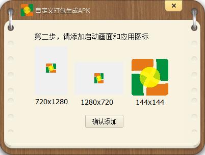
接着,在弹出的对话框中,双击三个图片,分别设置APK的竖向启动画面、横向启动画面和桌面图标文件,图片格式为PNG图片文件。
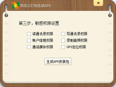
最后,在弹出的对话框,点击生成APK安装包,这样一个WebApp项目打包生成手机APP就完成了。
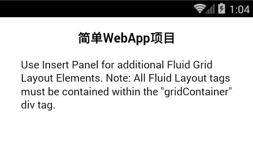
我们来看下安装到手机上的效果:
最后,我们学习下Dreamweaver CC生成的流体网格布局CSS文件,具体看源文件,我加了中文注释:
@charset "utf-8";
/** HTML5 ✰ Boilerplate v3.0.2
/*
 * HTML5 ✰ 样板
 *
 * 以下是诸多跨浏览器样式研究的结果。
 *
 * ==|== 规范化 ==========================================================
 */
/* =============================================================================
   HTML5 display definitions  HTML5 显示定义
   ========================================================================== */
article, aside, details, figcaption, figure, footer, header, hgroup, nav, section { display: block; }
audio, canvas, video { display: inline-block; *display: inline; *zoom: 1; }
audio:not([controls]) { display: none; }
[hidden] { display: none; }
/* =============================================================================
   Base  基础
   ========================================================================== */
html { font-size: 100%; -webkit-text-size-adjust: 100%; -ms-text-size-adjust: 100%; }
html, button, input, select, textarea { font-family: serif; color: #222; }
body { margin: 0; font-size: 1em; line-height: 1.4; }
/* =============================================================================
   Links  链接
   ========================================================================== */
a { color: #00e; }
a:visited { color: #551a8b; }
a:hover { color: #06e; }
a:focus { outline: thin dotted; }
/* =============================================================================
   Typography 排版规则
   ========================================================================== */
abbr[title] { border-bottom: 1px dotted; }
b, strong { font-weight: bold; }
blockquote { margin: 1em 40px; }
dfn { font-style: italic; }
hr { display: block; height: 1px; border: 0; border-top: 1px solid #ccc; margin: 1em 0; padding: 0; }
ins { background: #ff9; color: #000; text-decoration: none; }
mark { background: #ff0; color: #000; font-style: italic; font-weight: bold; }
/* 重新声明固定宽度字体系列:  */
pre, code, kbd, samp { font-family: monospace, serif; _font-family: 'courier new', monospace; font-size: 1em; }
/* 改善所有浏览器中预先格式化的文本的可读性 */
pre { white-space: pre; white-space: pre-wrap; word-wrap: break-word; }
q { quotes: none; }
q:before, q:after { content: ""; content: none; }
small { font-size: 85%; }
/* 放置上标和下标内容,而不影响行高:  */
sub, sup { font-size: 75%; line-height: 0; position: relative; vertical-align: baseline; }
sup { top: -0.5em; }
sub { bottom: -0.25em; }
/* =============================================================================
   Lists 列表
   ========================================================================== */
ul, ol { margin: 1em 0; padding: 0 0 0 40px; }
dd { margin: 0 0 0 40px; }
nav ul, nav ol { list-style: none; list-style-image: none; margin: 0; padding: 0; }
/* =============================================================================
   Embedded content 嵌入内容
   ========================================================================== */
/*
 * 1. 改善在 IE7 中缩放时的图像质量:
 * 2. 删除图像容器上的图像与边框之间的间隙:
 */
img { border: 0; -ms-interpolation-mode: bicubic; vertical-align: middle; }
svg:not(:root) { overflow: hidden; }
/* =============================================================================
   Figures 图
   ========================================================================== */
figure { margin: 0; }
/* =============================================================================
   Forms 表单
   ========================================================================== */
form { margin: 0; }
fieldset { border: 0; margin: 0; padding: 0; }
/* 指示“label”会将焦点移至相关联的表单元素 */
label { cursor: pointer; }
legend { border: 0; *margin-left: -7px; padding: 0; white-space: normal; }
/*
 * 1. 纠正所有浏览器中非继承的字体大小
 * 2. 定义在所有浏览器中一致地垂直对齐显示
 */
button, input, select, textarea { font-size: 100%; margin: 0; vertical-align: baseline; *vertical-align: middle; }
button, input { line-height: normal; }
button, input[type="button"], input[type="reset"], input[type="submit"] { cursor: pointer; -webkit-appearance: button; *overflow: visible; }
/*
 * 显示手形光标,表示可以点击的表单元素
 */
button[disabled], input[disabled] { cursor: default; }
/*
 * 一致的框大小和外观
 */
input[type="checkbox"], input[type="radio"] { box-sizing: border-box; padding: 0; *width: 13px; *height: 13px; }
input[type="search"] { -webkit-appearance: textfield; -moz-box-sizing: content-box; -webkit-box-sizing: content-box; box-sizing: content-box; }
input[type="search"]::-webkit-search-decoration, input[type="search"]::-webkit-search-cancel-button { -webkit-appearance: none; }
button::-moz-focus-inner, input::-moz-focus-inner { border: 0; padding: 0; }
/*
 * 1. 删除 IE6/7/8/9 中的默认垂直滚动条
 * 2. 仅允许垂直调整大小
 */
textarea { overflow: auto; vertical-align: top; resize: vertical; }
/* 用于表单验证的颜色 */
input:valid, textarea:valid {  }
input:invalid, textarea:invalid { background-color: #f0dddd; }
/* =============================================================================
   Tables  表格
   ========================================================================== */
table { border-collapse: collapse; border-spacing: 0; }
td { vertical-align: top; }
/* =============================================================================
   Chrome Frame Prompt
   ========================================================================== */
.chromeframe { margin: 0.2em 0; background: #ccc; color: black; padding: 0.2em 0; }
/* ==|== 非语义的 helper 类 ========================================
   请在进入此部分之前定义您的样式。
   ========================================================================== */
/* 用于图像替换 */
.ir { display: block; border: 0; text-indent: -999em; overflow: hidden; background-color: transparent; background-repeat: no-repeat; text-align: left; direction: ltr; *line-height: 0; }
.ir br { display: none; }
/* 同时在屏幕读取器和浏览器中隐藏:  */
.hidden { display: none !important; visibility: hidden; }
/* 仅可视隐藏,但在屏幕读取器中可用:  */
.visuallyhidden { border: 0; clip: rect(0 0 0 0); height: 1px; margin: -1px; overflow: hidden; padding: 0; position: absolute; width: 1px; }
/* 扩展 .visuallyhidden 类以允许元素可在通过键盘浏览时成为焦点:  */
.visuallyhidden.focusable:active, .visuallyhidden.focusable:focus { clip: auto; height: auto; margin: 0; overflow: visible; position: static; width: auto; }
/* 可视隐藏且在屏幕读取器中隐藏,但保留布局 */
.invisible { visibility: hidden; }
/* 包含浮动:  */
.clearfix:before, .clearfix:after { content: ""; display: table; }
.clearfix:after { clear: both; }
.clearfix { *zoom: 1; }

/* ==|== 主要样式 =====================================================
   作者:
   ========================================================================== */
@charset "utf-8";
img, object, embed, video {
	max-width: 100%;
}
.fluid {
	clear: both;
	margin-left: 0;
	width: 100%;
	float: left;
	display: block;
}
.fluidList {
    list-style:none;
    list-style-image:none;
    margin:0;
    padding:0;
}
/* Mobile Layout: 480px and below. */
.gridContainer {
	margin-left: auto;
	margin-right: auto;
	width: 86.45%;
	padding-left: 2.275%;
	padding-right: 2.275%;
	clear: none;
	float: none;
}
#div1 {
}
.zeroMargin_mobile {
    margin-left: 0;
}
.hide_mobile {
    display: none;
}
/* Tablet Layout: 481px to 768px. Inherits styles from: Mobile Layout. */
@media only screen and (min-width: 481px) {
.gridContainer {
	width: 90.675%;
	padding-left: 1.1625%;
	padding-right: 1.1625%;
	clear: none;
	float: none;
	margin-left: auto;
}
#div1 {
}
.zeroMargin_tablet {
    margin-left: 0;
}
.hide_tablet {
    display: none;
}
}
/* Desktop Layout: 769px to a max of 1232px.  Inherits styles from: Mobile Layout and Tablet Layout. */
@media only screen and (min-width: 769px) {
.gridContainer {
	width: 88.5%;
	max-width: 1232px;
	padding-left: 0.75%;
	padding-right: 0.75%;
	margin: auto;
	clear: none;
	float: none;
	margin-left: auto;
}
#div1 {
}
.zeroMargin_desktop {
    margin-left: 0;
}
.hide_desktop {
    display: none;
}
}